Project Brief
Domo specializes in business intelligence tools and data visualizations, so offering customers a way to get that information faster seemed like a unique opportunity. Utilizing the small real estate of a widget, I needed to accommodate a large amount complex data customized to each user into a single preview.
Project Overview
At Domo there are many teams that work on various parts of the product. I work on the mobile team and was the designer in a Product Trio made up of an engineer and project manager. The three of us worked together to build this feature.
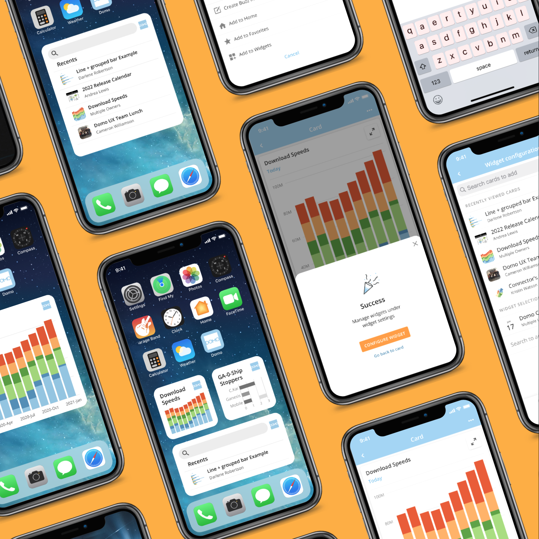
Domo iOS widgets
Realtime updates and previews of data most important to you.
Version 1
Project Type IOS Mobile App, Domo, Internship
Role UX & UI
Team Christina (UX), Josh (PM) & Bryan (Engineer)
Tools Figma & Jira
Defining and establishing
the problem.
Understand and analyze.
Understand the problem
What problem am I trying to solve?
Data can change and update every minute of the day, how much of that goes unnoticed?
If business users are not already working in the Domo App, this means they are missing out on real time updates to important data. Even while Domo is a powerful BI tool, missing an update is still possible if you aren’t monitoring your data constantly.
Problem Statement
How can I surface a variety of data and data types so business users are able to see important data updates?
Analyze
Make sense of the problem.
Why is the problem important?
Users find it frustrating task to navigate through Domo’s entire app to find specific data that is frequently interacted with.
Surfacing the latest updates without opening the app would provide an opportunity for customers to respond to that data at the opportune time.
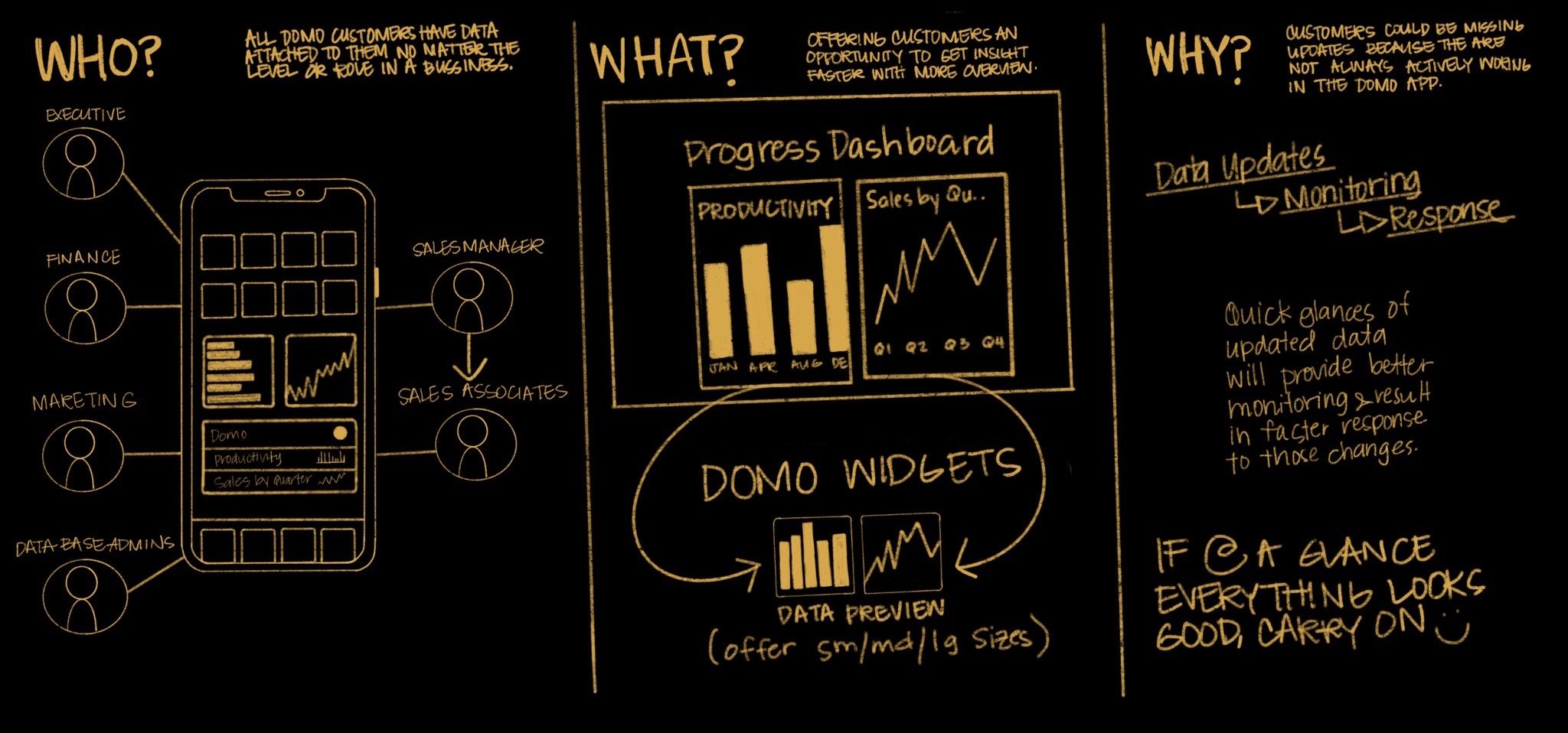
Who am I solving this for?
Any Domo customer would benefit from having at a glance access to their data. No matter the role, every individual has data attached to them.

Floor sales associate
Could use constant updates to see what needs to be restocked.
Could use for new shipment dates
Could use to manage what daily tasks are left to complete.


Data Base Admin
Could view datasets/dataflows with errors.
Could view datasets/dataflows in progress.
Could view run schedules, etc.

Marketing Manager
Could oversee marketing budgets.
Could have access to constant updates to data sets regarding marketing effectiveness.
Could view statistics on social media engagement.

Executive
Could have overview of sales and performance.
Might want to see latest dataset charts or graphs to help them predict things.
Data at glance would allow for quick adjustments in making proactive business decisions.
Store Manager
Could see shift overview and schedules.
Could use to see team performance and daily sales.
Could use for inventory overview.
Possibly use to see and manage tasks.
More Research & Explanation
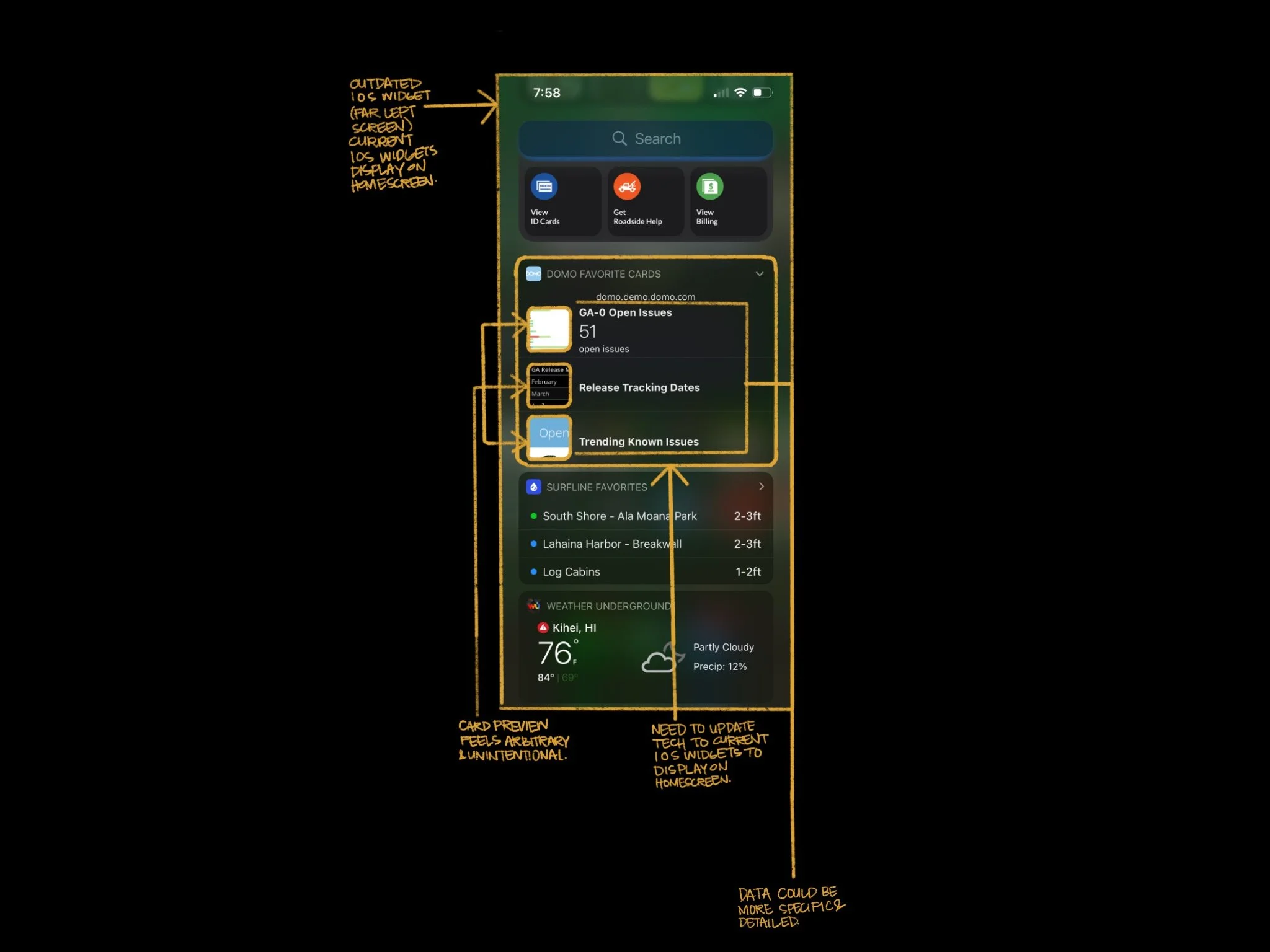
Discovering unknown settings buried in the UI
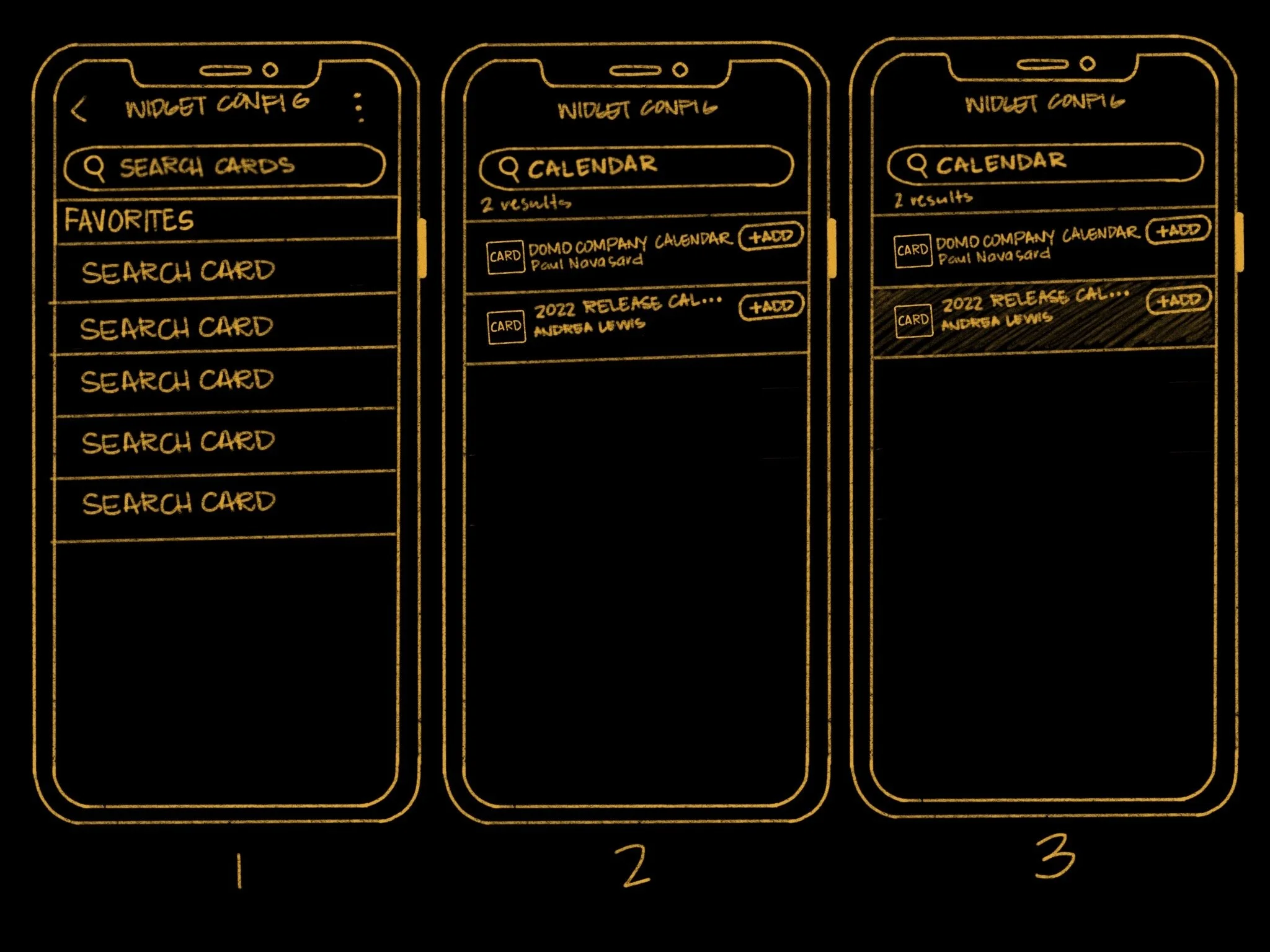
After going through the Domo app, searching for a way to onboard customers. I found an unknown widget setting which was buried deep in the app’s UI. The setting linked selected cards found in a favorites menu that could configure a widget. However, the widget configuration needed work, the flow took too many steps to get a widget loaded to your home screen. That meant a large learning curve for customers especially because the feature was hidden.

Tearing down the buried UI.
Analyzing the current experience.


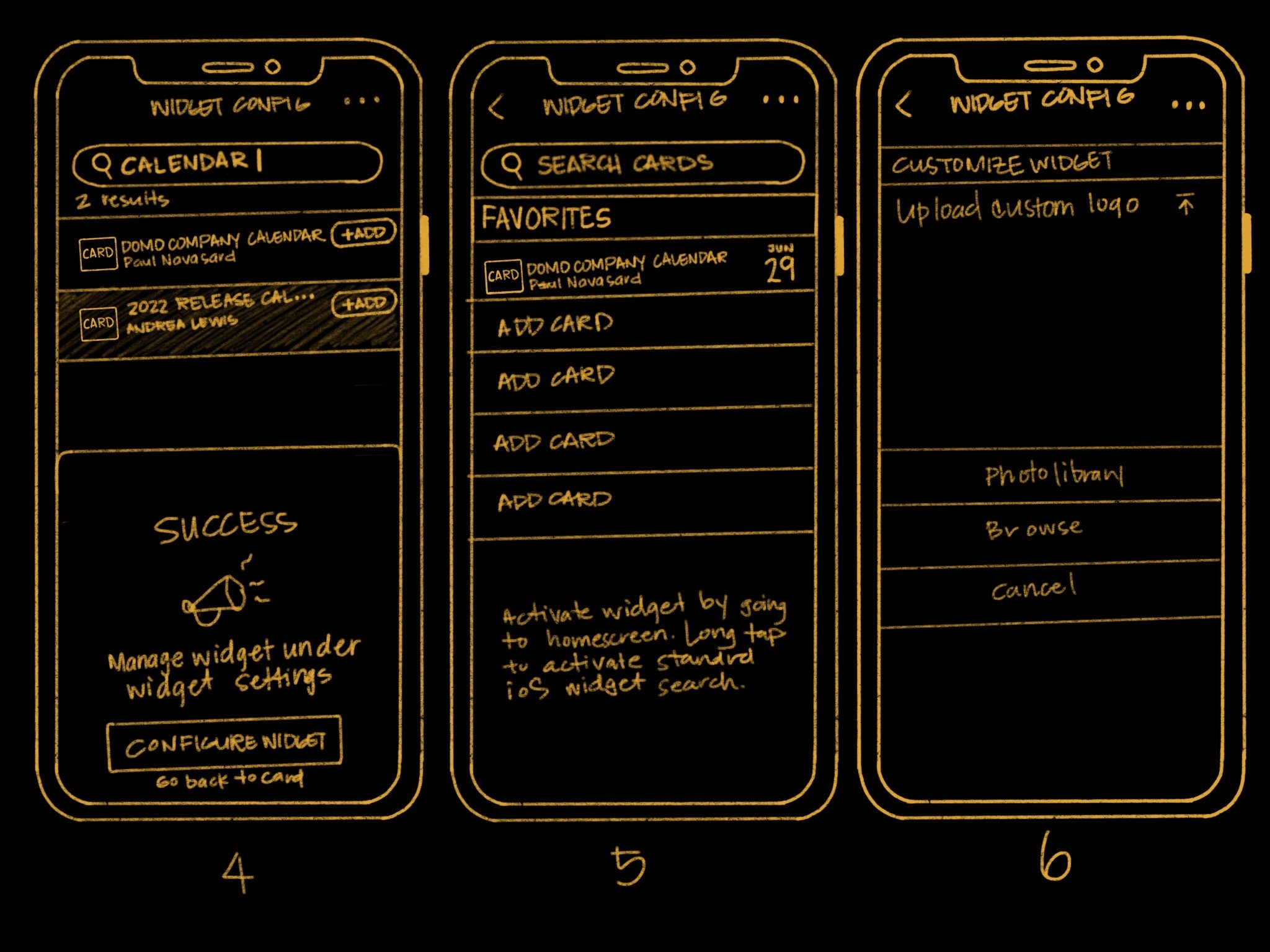
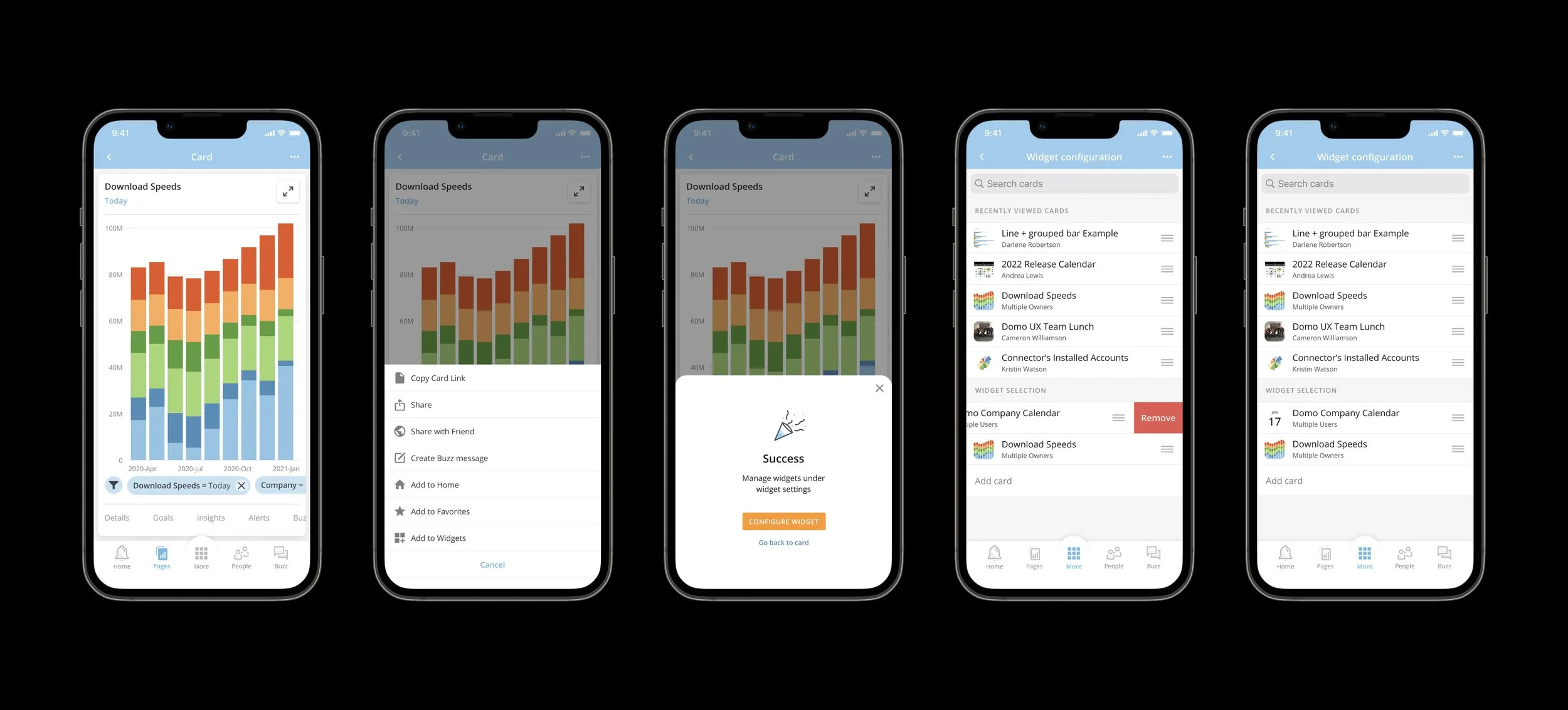
Solution
Data at a glance
After I found the existing setting, I realized that even though the widget configuration was available, the onboarding process needed to be reworked. As far as the data preview, there was still a loss in translation. The widgets were not easy to scan and with such a wide variety of data, I needed to find the solution which could accommodate graphs, tables, and charts.
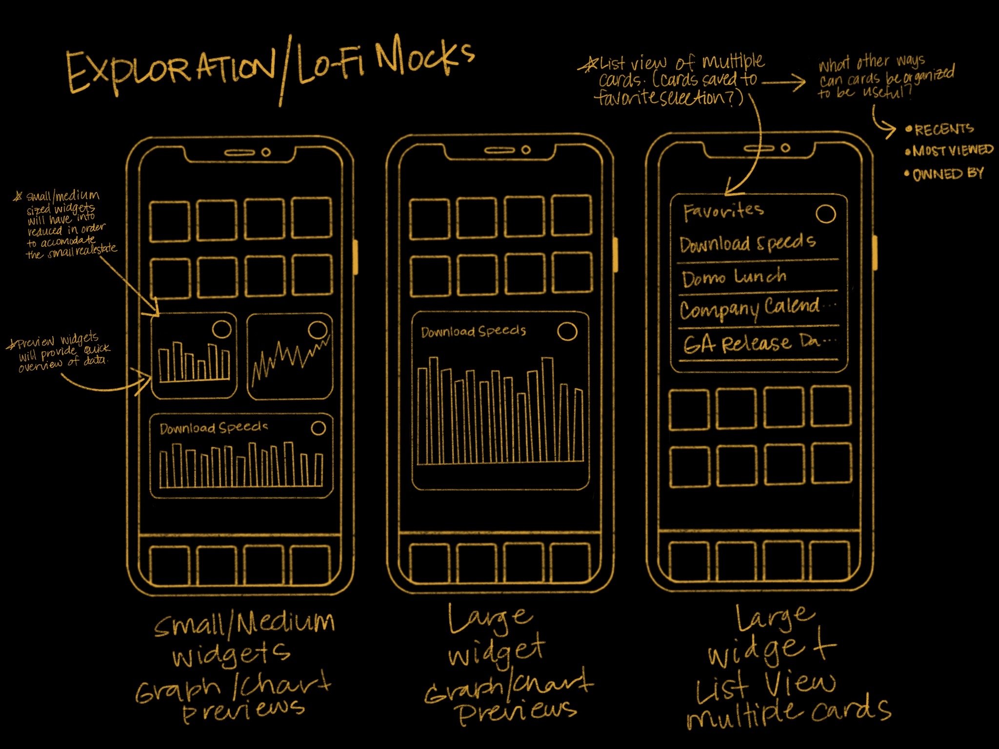
Exploration
On-boarding
Formatting
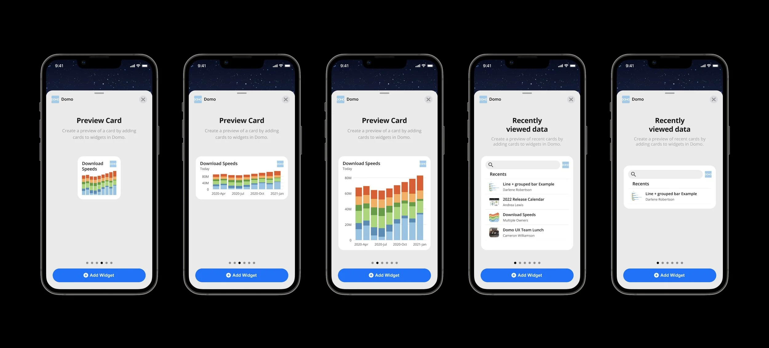
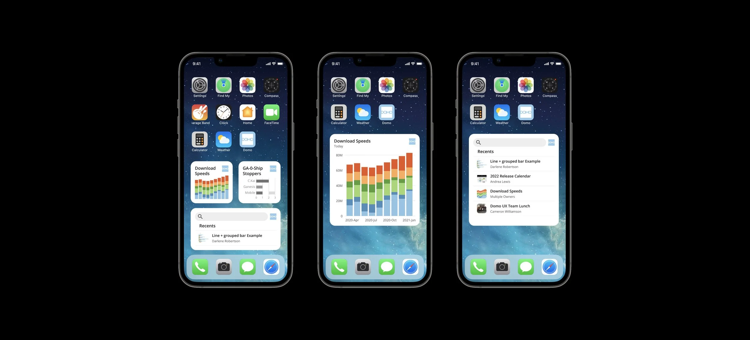
I decided the best way to surface the variations of data in 2 different formats.
A preview
A list of recents with a search.
-
This widget would display an actual preview of a single card. The preview might be a graph, chart or other variation of data.
-
This widget would be a list format of your top 5 recently viewed cards. It would also provide a search so users can link directly into the Domo search to find anything else they might find important.
Widget variations:
Final Screens
Learnings & take aways
You’re in this for the long haul.
UX design constantly tests your endurance. Just when you think you’ve figured things out and are ready to move into finalizing something, another state or flow you never thought of pops up leaving you right back at pen and paper again.
Writing can help organize thoughts and ideas.
I found that when feeling totally stumped what helped get me out of that mental block was simply just going back to re-establishing the problem I was solving. Getting back to the “Whys” really helped me emerge from those times when you just can’t get it sorted. Writing and quick concept sketching gave me the flexibility to just get things out of my brain. It helped with getting lost in the details and the pressure to make things perfect went out the window.
If I had more time.
If I had more time, I think I would have pushed for prescribed data and tried to sort out how we might be able to customize what data gets surfaced based on your role and what your company wants those individuals to focus on.
Fortunately this is being considered for a Version 2.